ComWorks
My project goal was to apply UI principles to redesign the ComWorks website. This case study will walk you through my design process.

Introduction to Project
ComWorks is a gaming center based in Los Angeles, California. Gamers are their primary customer base, but they also offer additional services such as general computer Internet access and printing services.
My project goal was to apply UI principles to redesign the navigation for the ComWorks website.
My Design Process
In the discover phase, I wanted to learn about as much about a topic in depth. I began with generative research about the user, the user’s goals/needs, and frustrations.
With my research, I started to synthesize & define a problem statement for my users.
Then, I was able to start to brainstorm multiple design solutions to solve the problem.
I was then able to then deliver my solution to my shareholders, a solution that is backed by the research in all of the previous steps.
Heuristic Evaluation
The current ComWorks website was dysfunctional. The website had many broken links which made it impossible to navigate the website. The information architecture was not established, and there was room for styling to increase readability.

Competitive Analysis
I looked at other local gaming centers to understand the market. Ultimate ESports, Localhost Fullerton and eCyberdeck all offered an option to reserve online in advance, whether it was to book an event like a birthday party or a private room. ComWorks was the only one who did not have this feature.

User Interviews
I wanted to generate as much research as possible by asking open-ended questions.
-
What are your favorite (and least favorite) parts about gaming?
-
Describe your ideal environment for playing video games.
-
Tell me about your experience at an Internet cafe.
-
Describe the process of how you would choose an Internet cafe.
I wanted to highlight the following quotes:
-
“The reason why I go to Internet cafes is to game with my friends. I actually don’t think I can recall a time I went to an internet cafe by myself. Otherwise, I’d just stay home and game in my PJ’s.”
-
“It’s really a bummer if there aren’t enough (computers). It happened to us before - I think there was an event of some sort. Now I try to call ahead and make sure there are enough available and no events going on that day.”
-
“(To choose a place) I go to the website/Yelp and go straight to the gallery pictures to see if it’s clean and if it’s big enough for my group.”
-
“I want there to be no problems when I game - (cafes) need to have quick game set-up and no lag time.”
Affinity Map
When I sifted through the interviews, it became clear that there were a few common themes gamers experienced.
The top four "I" Statements:
-
I like to be comfortable when I game.
-
I want to get into my game quickly without interruption.
-
I find it frustrating when there are not enough computers.
-
I want to have fair and friendly competition.
Key Findings
Gamers prioritize comfortability when gaming, gamers like to sit near their friends when they game in-persona and gamers typically call the cafe to ensure there are enough computers available.
Personas
From my research, I created two personas to represent our users so I could focus on who I was building the solution for.
My primary persona is Kelsy, a social gamer. Tom, a competitive gamer is the secondary persona.
Both of them enjoy gaming with their friends and would like to know where they are sitting in advance. However, they differ in their motivations for choosing seats and priorities when gaming.


User Journey Map
Kelsy wants to ensure that the cafe can accommodate her group so they can game together. She wants to check the availability ahead of time so that she doesn’t waste time the day-of. She calls ComWorks, but is met with an automated voice system that directs her back to the website. She begins to feel frustrated with this experience as the website does not have clear information and she is unable to speak with a worker to get the information she needs.

The Problem Statement
I realized that calling is not a viable solution.
Kelsy needs a reliable way to reserve computers because she wants to ensure there are enough computers for her to game with her friends.
Because if there are not enough computers, Kelsy could have a negative experience waiting at the cafe or might end up leaving altogether.
How Might We's
I began to wonder - How might we remove the need for the user to call the cafe so they aren’t met with the same frustrating situation like Kelsy did. What if it was possible for users to see what computers are currently available or to be able to book computers in advance? What if they can specify how many they would need and be able to pick which one it could be.
There’s a membership log-in on the website, so how might we utilize this function to make it easier for returning users to reserve & checkout?
Comparator Analysis
At this point, I knew I needed to look at some comparators that already had a reservation system that works. I looked specifically at companies selling movie tickets, concert tickets and airline tickets. These all allowed for customers to see what seats are available, select the seats and reserve in advance. I did task analyses on each of these to inform a user flow for ComWorks.
User Flow
A User Flow’s purpose is to demonstrate the process a user will take through the proposed solution.
For instance, Kelsy is with her 3 friends and they are looking for something to do right now. She would open the ComWorks website. She would then look at the currently available computers under the reservation tab. She would decide how many seats she needs and look at the available seats. Do these meet her expectations of being available and close enough to her friends? If it does, she can proceed to selecting seats.
But let’s change the scenario and say Kelsy is looking to book time at an internet cafe in advance because it takes awhile to coordinate all her friends’ busy schedules or it’s for a special event like a birthday. If this is the case, she would go to the website, select the FUTURE day and time, browse seats & select the seats.
For both scenarios, after selecting seats, she would receive a summary page and review if the information is correct. If so, then she would sign-in to her existing account or register to create an account. After that, she could proceed to payment options & she will receive a confirmation email once booked.
For either of these scenarios, if she did not like the options given or they did not meet her needs, she could MODIFY her details, or RETURN to the home screen.
Wireflows

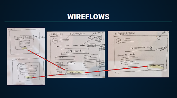
After mapping out the user’s actions and decisions, I created a wireflow. This wireflow focuses on the sequence of interactions a user would complete - in a different visual format than the user flow.
From this wireflow, you can see she would open the website, click reservations, input details for time/date/duration then browse what’s available. She would select the amount of seats she would like and continue to review the details including rates.
She would then sign-into her account or create an account.
Wireframes
Based on the userflow, I created sketched wireflows and turned them into digital LowFi wireframes to help me determine which affordances to include and where to put them. This process was important because it helped me quickly work out my thoughts and rearrange things quickly. I began to figure out the sequence that I wanted for my user to complete the checkout process. The prototype started to take shape.
Sitemap
But I wanted to make sure the site would be easy to navigate unlike the current website. I created a site map (based on feedback from a card sort) in order to help me structure the webpage navigation.

Usability Tests
Users were looking for a clearer way to ensure enough computers to game with their friends, so I implemented a reservation system. I conducted a moderated usability test to learn more about my users and identify any potential difficulties with the checkout process.
Scenario: Imagine being a social gamer who wanted to game with 3 friends at an internet cafe in-person on July 24th from 6-9 pm and complete some tasks.
Goal: I wanted to see how users would navigate through the website and if the flow, call to actions, and labels made sense. Were the users able to complete the task? Are they satisfied? Is the information was positioned when and where the user expected to find it? What types of errors/pain points occur?
Tasks
-
Show me how you would ensure that the cafe offers a game that you and your 3 friends could play together.
-
Show me how you would calculate how much it would cost the group to visit the cafe.
-
Show me how you would ensure there are enough computers for your group on your desired date.
-
Show me how you would go about reserving a spot for 3 hours.
-
You previously booked some computers, but your plans have changed and you cannot make it anymore. Show me how you would go about it.
Metrics
-
Success rate (Quantitative): The percent of users who could successfully complete the task without any questions - shows how clear and intuitive website is
-
User satisfaction via Likert scale (Quantitative): Satisfaction level of users - can use to compare to current level of satisfaction with website
-
Number of clicks (Quantitative): How many clicks the average user took to go through the flow - shows how well website indicates roadmap
-
Types of errors (Qualitative): What types of errors were present among the users - shows the errors with the logic/flow
-
First impressions (Qualitative): What the user’s first impressions of the site were - shows how the user perceives the website
-
Pain Points (Qualitative): What the users deemed as confusing or frustrating - shows us where we can improve
Usability Test Results
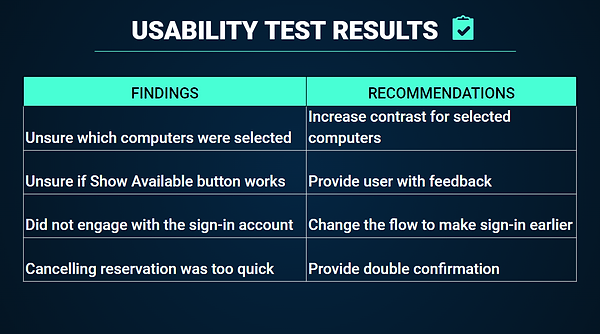
I discovered that users had a difficult time navigating through the website so I changed the scale and added more details to my scenario for clearer directions.
I also discovered that users needed visual feedback and higher color contrast. One user said, “It’s hard to see which computers are selected. These are too dark.” (As they pressed the button multiple times) “Does this (Show Available) button work? Why didn’t anything happen?”
I also discovered that users wanted to be able to freely maneuver around the website so I made it easy for them to click out of overlays and gave them multiple options for navigating with buttons and/or tabs.
But the biggest thing I discovered was that users did not engage with the sign-in/create account process at the end of the checkout.
With this in mind, I began to reconsider the USER FLOW so that the user would find creating an account to be useful. An account would allow the user to make a reservation, as well as easily manage their reservations at a later time. It would make the payment process easier for the user if we already had a name and email on file as well.
Now, I’m going to walk you through my prototype so you can see how I implemented these changes.


Next Steps
As you can see in the final prototype, Kelsy is reassured that she will be able to game with her friends and looks forward to her time at ComWorks. This solution will not only help Kelsy, but will also be a feature that Tom and many other users could use too.
In the future, ComWorks should continue to develop and utilize these features more. What more could they do with the account information? How could they use that to track peak hours, staffing needs, or user preferences as they continue to grow and scale?
Since ComWorks main user base are gamers, I would be interested to explore more of the eSports world and tie in events and social media into ComWorks’ website more. This will allow for a true feeling of a gaming community and hopefully build more return users.